TVA PROJECTS
Web design & development, user research, design system
Homepage Redesign
CHALLENGE
Update the current TVA.com homepage. The page should have a clean modern look, educate users about TVA, highlight new TVA initiatives, and allow users to quickly access popular topics (i.e. lake levels and careers).
SOLUTION

Analytics post-launch:
-
31% increase in average engagement time (compared from 2023 previous version, to 2024 updated version).
-
45,000 - 100,000 views per month
Reflection
-
It was exciting to launch the final culmination of many years of work and research! I think the updated homepage is cleaner and focuses more on what users are interested in (who is TVA, careers, lake levels, recreation etc.). The homepage is the most visited part of the website, so I was glad we were able to use analytics and user research to guide our design decisions.
-
Some areas for improvement are decreasing page length and improving language for people who have no familiarity with TVA or region so it’s less technical.
PROCESS
My Role: UX Researcher, UX/UI Designer, Development

DISCOVER
-
References like Southern Company and Duke Energy, were gathered. TVA is involved with many sectors so we also identified other multi-faceted businesses like city government websites.
-
Analytics, content reviews, usability reviews were conducted for the current TVA.com, to get a baseline measurement of the website.
-
Conducted user interviews with participants to gain insight about their perceptions of TVA.com.

DEFINE
-
Based on the content reviews, user research, analytics, and references we identified that the homepage needed to be:
-
Visually appealing
-
Engage and inform the general public about TVA
-
Have short summaries with the option to read further, and allow them to easily access popular topics (i.e. TVA kids, lake levels, careers).
-
-
User archetypes and pain points were also created to help guide design decisions.

DEVELOP
-
The user research, references, and analytics gathered in the discover phase were used to guide design of the wireframes and mockups.
-
Once the mockups were approved, the page was built in acceptance of Sitefinity (web builder) for the final review.

DELIVER
-
Once the page was approved and tested in Acceptance, it was moved to production and ready for launch!
If you're interested in seeing the full project, reach out to me for the password to the private page.
Careers Redesign
CHALLENGE
Update the entire careers section on TVA.com. The page should have a modern look and allow users to quickly understand different roles at TVA, how to apply, benefits, and access the job portal.
SOLUTION

Analytics post-launch:
-
34% increase in views, and 44% increase in average engagement time (compared from 2023 previous version, to 2024 updated version)
30,000 - 60,000 views per month
Reflection
-
Since this is the 2nd highest visited part of TVA.com it was nice to update it to be more visually appealing and user friendly.
-
I think areas of improvement are decreasing the amount of content on the careers homepage, making the button/CTA’s more concise, and rethinking the amount of pages within the section.
PROCESS
My Role: UX/UI Designer

DISCOVER
-
Analytics for this section illustrated that careers was the 2nd highest traffic part of TVA.com, with about 30,000 - 50,000 views per month.
-
References from other job sites in energy companies were reviewed.
-
Research for language and topics of interest with users were conducted by an outside agency.

DEFINE
-
Based on the analytics, user research, and references we identified the careers update should provide info about open jobs, applications, benefits, and be visually appealing.

DEVELOP
-
The user research, references, and analytics gathered in the discover phase were used to guide design of the wireframes and mockups.
-
Once the mockups were approved, the page was built in acceptance of Sitefinity (web builder) for the final review.

DELIVER
-
Once the page was approved and tested in Acceptance, it was moved to production and ready for launch!
If you're interested in seeing the full project, reach out to me for the password to the private page.
Design System
CHALLENGE
Establish brand and design standards for TVA digital platforms, that is cohesive to the current TVA brand standards for print. These standards will be shared internally and externally to ensure TVA's brand is represented consistently across various websites and apps.
SOLUTION

We created a design system that:
-
Establishes style standards for color, fonts, and logos
-
Built a component library for use across different websites, with usage guidelines
-
Outlined UX best practices for design, text, and and style
-
Updated CSS styles so designs were seamlessly transferred from Figma to SiteFinity (web builder)
Reflection
-
Establishing a digital design system from scratch was difficult, since there were so many different elements to take into account. However, each new project helped us discover and further define our guidelines.
-
Even though the design system will always be a work in progress, it was essential to begin in order to evolve TVA.com. Now that we've built a robust internal library, we're beginning to work on creating files to share externally.
PROCESS
My Role: UX/UI Designer, Development

DISCOVER
-
Reviewed the existing print brand guidelines to understand the general style.
-
References of other design systems, like Human Interface Guidelines, material design, US Web Design System, were reviewed.

DEFINE
-
Reviewed what was currently established in SiteFinity (CMS and web builder) and by our team, in order to create a list of what needed to be built.

DEVELOP
-
We established font and color styles first. Then through a bit of trial and error in different projects, we tested out different component styles and layouts.
-
Once we had a robust component and style library we went back through and further refined guidelines and aligned with SiteFinity (CMS and web builder).

DELIVER
-
Now we have an established internal library and are working on building sharable files for external partners.
ADDITIONAL PROJECTS

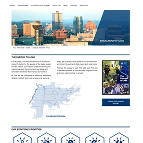
Annual Report 2023
My Role: Design lead, UX/UI Designer
Analytics 12 months post launch
-
Views 6104
-
Average engagement time: 1 min 19s
-
Engagement rate 70%
General Process
-
Discover
-
User interviews, analytics review, bench-marking
-
-
Define
-
Webpage to host Annual Report FY 23
-
-
Develop
-
Designed in Figma, built in Sitefinity
-
-
Deliver
-
Launch page!
-

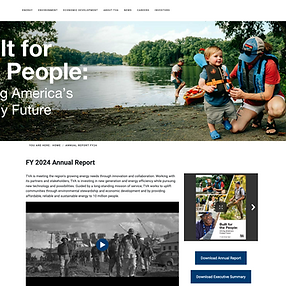
Annual Report 2024
My Role: Design lead, UX/UI Designer
Analytics 12 months post launch
-
Views 4312
-
Average engagement time: 47s
-
Engagement rate 66%
General Process
-
Discover
-
User interviews, analytics review, bench-marking
-
-
Define
-
Webpage to host Annual Report FY 24
-
-
Develop
-
Designed in Figma, built in Sitefinity
-
-
Deliver
-
Launch page!
-

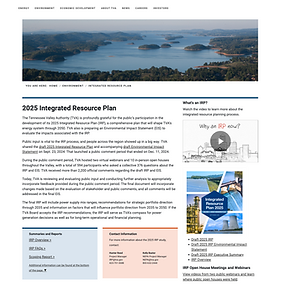
Integrated Resource Plan (IRP) Visit page >
My Role: Design lead, UX/UI Designer
Analytics 12 months post launch
-
Views 71,000
-
Average engagement time: 9s
General Process
-
Discover
-
User interviews, analytics review, bench-marking
-
-
Define
-
Webpage to educate users on TVA's IRP, find public meetings, and view IRP reports
-
-
Develop
-
Designed in Figma, built in Sitefinity
-
-
Deliver
-
Launch page!
-
